
K-Block
Designing a block chain explorer and NFT analytics platform

Context
Team
Product Designer (my role)
Engineers
Product Manager
UX Writers
UX Research
Tools
Figma, Figjam, Google Workspace, Zoom, Otter AI, Notion
Skills
Interaction Design
Prototyping
Visual design
Overview
Background
K-blocks mission is to make a more robust analytics tool for Kadena coin. The "K" in K-Block stands for Kadena, as in Kadena coin. This crypto currency specializes in scalability with potential for cheaper and faster minting.
Problem
Kadena coin lacks robust analytic applications, creating a demand for improved analytics tools.
The problem with current tools:
Not enough info
Not beginner friendly
Difficult to understand
Solution
Create a K-Block chain explorer and NFT analytics tool usable for all experience levels.
Remove barrier to entry
Help avoid scams
Help users leverage analytics to understand market insights
Outcomes
28% lower rate of confusion finding relevant blocks
18% faster navigation to relevant blocks by beginner users
106% increase in popup tips
Project Preview

Usability audit of previous design
After familiarizing myself with Kadena coin I began to try to understand why users were getting confused by auditing the pages according to design best practice.
Problem #1: Basic UI alignment, heirarchy and grouping issues

Problem #2: Failure to visually differentiate multiple transactions

Design Explorations: Transaction Summary Page
Exploration #1: Bento style to organize information and show familiar UI
💡 Why it works
Common pattern used by competitors
Visually organized layout, dividing content in distinct compartments to improve clarity of information
🚫 Why it didn't work
Separating the sender/ receiver did not make it seem like it was part of the transaction summary
It was not as easy to scan making it harder for the users

Exploration #2: Figuring out how to display easy to understand transactions
💡 Why it worked
Kept sender and receiver separate & added payment information - to make it easier to understand
❌ Why it didnt work
It was not scalable to show multiple transactions.
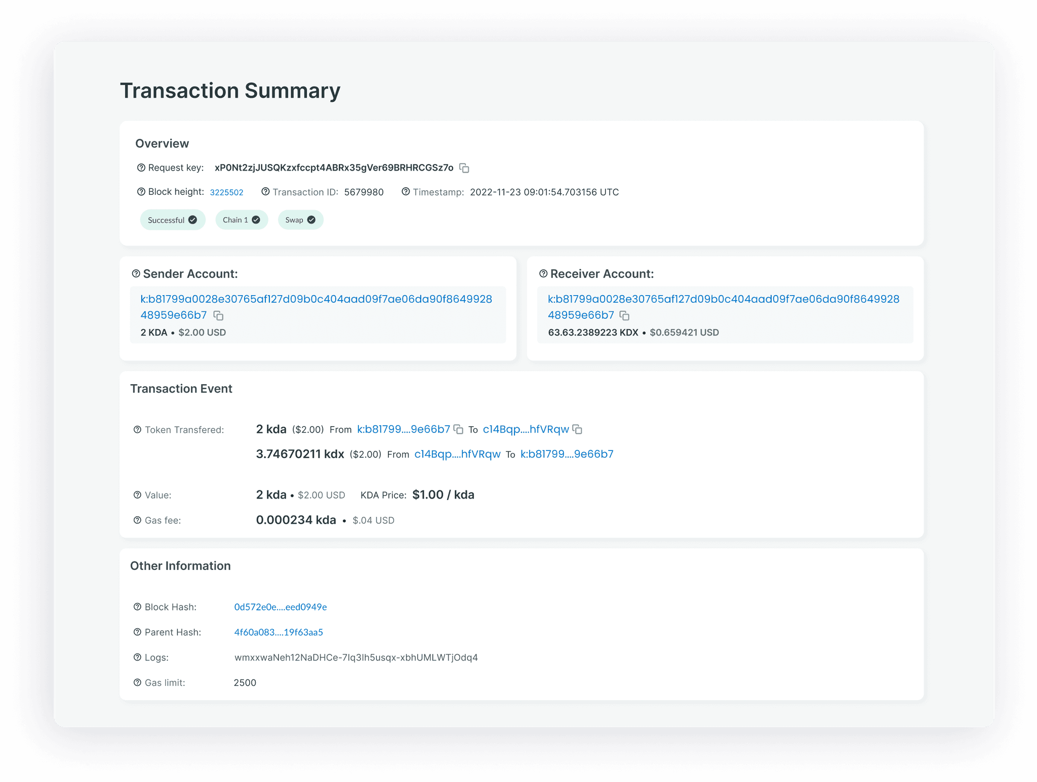
Exploration #3: (WINNER) Keeping the layout simple, and improved grouping
💡 Why it worked
Easy to understand at a glance
Can accommodate for multiple transactions

Before

After

Usability Testing Results
Methods:
23 Remote Moderated Usability Testing conducted by the research team
Findings:
New users to crypto coin found the website confusing, still unsure what things meant
Experienced users were impressed by quality / information
"K-Block’s data analytics is more comprehensive than other options, a one-stop-shop for high priority blockchain information. I'm highly impressed with K-Block." - Usability testing participant
Outcomes:
28% lower rate of confusion finding relevant blocks
18% faster navigation to relevant blocks by beginner users
106% increase in popup tips
Commendation from client 👏
“Such a great experience balancing between miners, devs and traders. So well thought out”
Next Steps
Gathering insights from Beta testing to inform the next phase’s design decisions.
Incorporate candlestick analysis charts and other insights as recommended by UXR & Product team.
Find the unique value proposition and ensure feasibility before adding a NFT marketplace.
Add a Resources page, expanding on what’s deemed necessary and feasible in terms of educational content.
See More Work

Rooted Remedy Ashiatsu Massage - Website Redesign

Goat Guide- Concept Mobile Application